I’m thrilled you’re here, dreaming up ways to transform your kitchen. Your white cabinets are like a blank canvas, ready to shine with the perfect paint color.
They brighten your space, bounce light around, and pair with just about anything. But picking the right wall color? That’s where the magic happens.
Let’s dive into this guide to find the ideal hue for your kitchen. I’ll walk you through 11 stunning paint colors, share why they work with white cabinets, and sprinkle in practical tips to make your space feel like you.
Ready? Let’s get started.
The 11 Kitchen Paint Colors for White Cabinets
Each color below is your ticket to a kitchen that’s both beautiful and functional. I’ll describe the vibe, explain why it pairs so well with white cabinets, break down pros and cons, and share styling tips.
Plus, I’ll highlight how each color meets a specific need—whether you’re craving a trendy look, a budget-friendly refresh, or a space that sparks joy. Let’s start with the classics and build up to the bold.
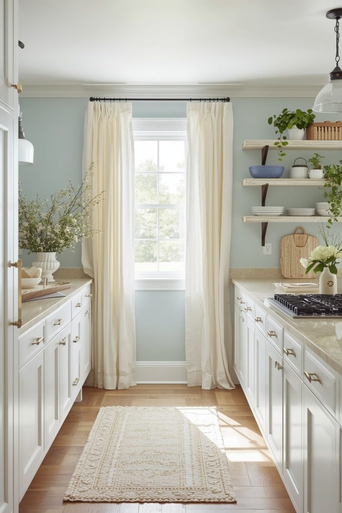
1. Soft Gray
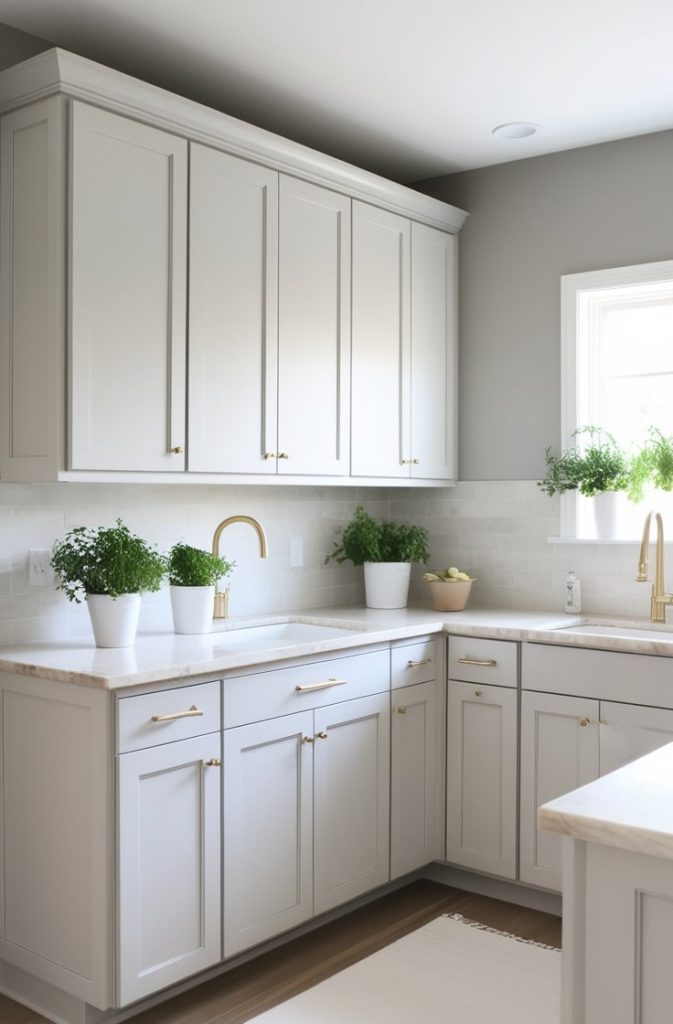
Imagine a misty morning, soft and serene, with a hint of taupe warmth. That’s Revere Pewter. It’s a greige—a gray-beige hybrid—that feels sophisticated without trying too hard. I love how it wraps your kitchen in understated elegance, like a cozy cashmere sweater.
Why It Pairs with White Cabinets
This soft gray flows seamlessly with white cabinets, grounding their crispness without stealing the show. It’s especially great with cool-toned whites, creating a spa-like calm. The subtle warmth enhances natural light, making your kitchen feel open and airy. It’s a no-fail choice for a polished look.
Pros and Cons
| Aspect | Pros | Cons |
| Space | Expands small kitchens visually | Can feel flat in low light |
| Mood | Serene, versatile | Less “wow” factor |
| Maintenance | Hides smudges well | Shows dust on glossy finishes |
Styling Tips
Pair Revere Pewter with brass cabinet pulls and creamy marble counters for a touch of luxury. Add some greenery—like a potted herb garden—for a farmhouse vibe. If your kitchen opens to a living area, this gray keeps the flow smooth. Try a satin finish for easy cleaning and a soft glow.
Verdict
This is your go-to if you’re new to painting or want a timeless look. It’s forgiving, hides minor imperfections, and boosts resale value. I’ve seen it work wonders in everything from tiny apartments to sprawling homes.
2. Warm Beige
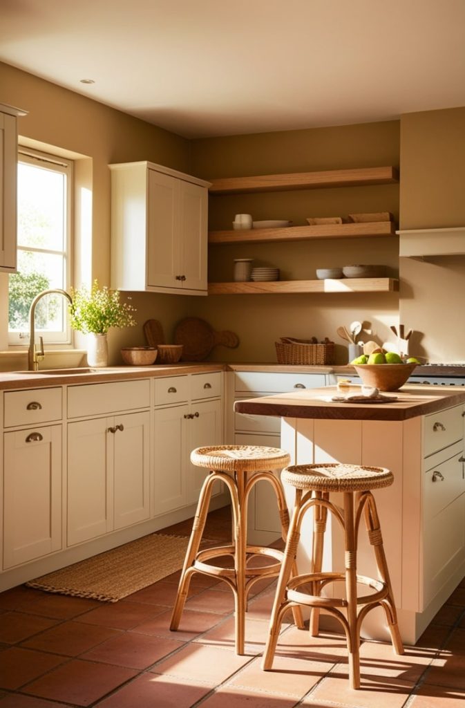
Picture a sun-kissed beach, warm and inviting, with golden undertones that feel like a cozy latte. Accessible Beige is all about comfort. It’s the color I’d choose for a kitchen where family gathers and stories flow.
Why It Pairs with White Cabinets
This beige softens the starkness of cool white cabinets, creating a balanced, family-friendly warmth. It’s neutral enough to blend with any backsplash but rich enough to add depth. Your kitchen will feel like a hug—welcoming and lived-in.
Pros and Cons
| Aspect | Pros | Cons |
| Space | Makes rooms feel larger | Can yellow in poor lighting |
| Mood | Welcoming, neutral | May lack personality |
| Maintenance | Easy to clean | Fades faster in sunny spots |
Styling Tips
Layer Accessible Beige with warm wood accents—like oak shelves—and terracotta floor tiles. A semi-gloss finish adds durability, perfect for busy kitchens. Try woven barstools for texture. This color loves natural elements, so bring in a jute rug or bamboo blinds.
Verdict
If you’re on a budget or refreshing a rental, this beige is a lifesaver. It’s versatile, affordable, and pairs with any decor. I used a similar shade in my old apartment, and it made the space feel like home instantly.
3. Navy Blue
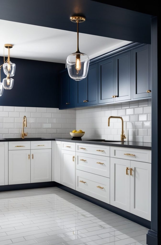
Close your eyes and imagine a deep ocean wave, rich and velvety, like a midnight sail under stars. Hague Blue is bold yet calming—a showstopper that feels like an adventure.
Why It Pairs with White Cabinets
Navy blue creates a striking contrast with white cabinets, giving your kitchen nautical drama. The white acts as an anchor, keeping the deep hue from overwhelming. It’s perfect for making a statement without chaos. Your cabinets will pop like sails against a stormy sea.
Pros and Cons
| Aspect | Pros | Cons |
| Space | Adds intimacy to large areas | Shrinks small spaces |
| Mood | Sophisticated, energizing | Can feel heavy if overdone |
| Maintenance | Hides fingerprints | Shows water spots easily |
Styling Tips
Accent Hague Blue with gold cabinet pulls and classic white subway tile. It’s ideal for coastal or modern kitchens. Add a glass pendant light for sparkle. I’d paint just one accent wall if your space is tight—say, behind your stove—for balance.
Verdict
Want a trendy, Instagram-worthy kitchen? This is it. Navy is huge for 2025, creating that “jewel box” effect readers love. I painted a friend’s kitchen island navy, and it’s now the star of her dinner parties.
4. Sage Green
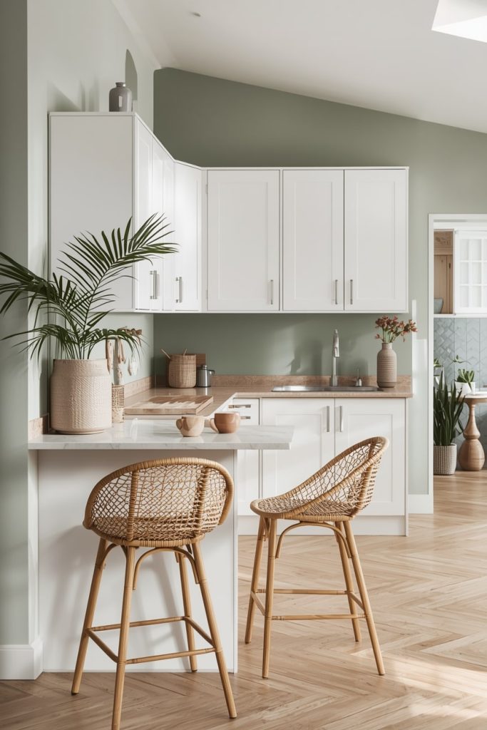
Think of a quiet herb garden, soft and leafy, with a hint of spring renewal. Back to Nature is a muted green that feels fresh and grounded. It’s like bringing the outdoors in.
Why It Pairs with White Cabinets
Sage green and white cabinets are a match made in heaven. The green’s organic vibe pairs with white’s clean lines, creating a fresh, uncluttered space. It’s subtle enough to feel calm but vibrant enough to avoid boredom. Your kitchen will feel like a sanctuary.
Pros and Cons
| Aspect | Pros | Cons |
| Space | Balances flow in mid-size rooms | Mutes in dim rooms |
| Mood | Calming, nature-inspired | Less versatile for bold styles |
| Maintenance | Stain-resistant | Foliage tones fade outdoors |
Styling Tips
Mix Back to Nature with rattan barstools and white oak floors. A matte finish gives that rustic charm I adore. Add ceramic planters or wooden cutting boards for texture. This color shines in farmhouse or boho kitchens.
Verdict
If wellness is your thing, sage green delivers. Color therapy says greens reduce stress, perfect for home cooks who spend hours chopping and stirring. I tried it in my breakfast nook, and it’s now my zen spot.
5. Charcoal Gray
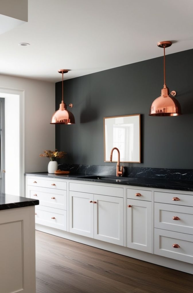
Imagine a stormy city skyline at dusk—smoky, sleek, and urban. Kendall Charcoal is bold and modern, with an edge that feels effortlessly cool.
Why It Pairs with White Cabinets
This charcoal gray creates a high-contrast, monochrome look that’s sleek and minimal. White cabinets lift its depth, making them pop like stars against a dark sky. It’s perfect for defining zones in open-plan homes without feeling heavy.
Pros and Cons
| Aspect | Pros | Cons |
| Space | Defines zones in open layouts | Darkens north-facing rooms |
| Mood | Edgy, contemporary | Can feel cold without warms |
| Maintenance | Super durable | Highlights every scuff |
Styling Tips
Pair Kendall Charcoal with copper pendant lights and black marble counters. An eggshell sheen makes cleaning a breeze. Add warm wood accents to soften the vibe. I love this for city lofts or modern homes with lots of LED lighting.
Verdict
Urban dwellers, this one’s for you. It enhances sleek lighting and feels like a trendy café. I helped a friend use it for her condo kitchen, and it’s now the talk of her building.
6. Blush Pink
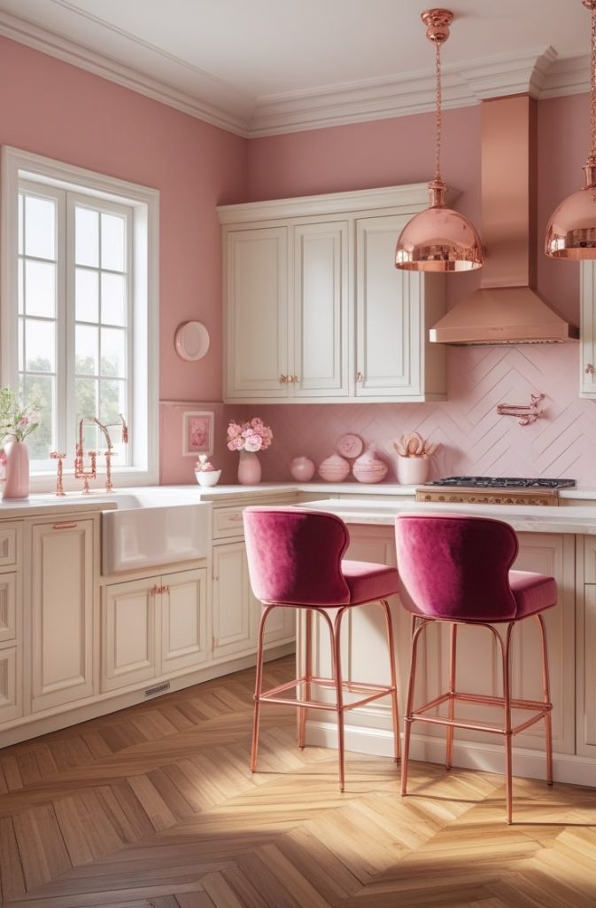
Picture a delicate rose petal, soft and romantic, like the first blush of dawn. Dreaming Tree is a whimsical pink that feels joyful without being childish.
Why It Pairs with White Cabinets
Blush pink softens white cabinets’ sterility, creating a warm, feminine glow. It’s like a cloud of sweetness wrapping your kitchen. The white keeps it crisp, preventing an overly sugary vibe. It’s a dreamy combo for a cozy, uplifting space.
Pros and Cons
| Aspect | Pros | Cons |
| Space | Brightens without overpowering | Fades in high-traffic areas |
| Mood | Joyful, uplifting | Risk of “dated” if too bright |
| Maintenance | Hides minor spills | Prone to sun bleaching |
Styling Tips
Pair Dreaming Tree with rose gold faucets and herringbone wood floors. Velvet barstools add luxe texture. I’d use this on an accent wall or lower cabinets for a playful touch. It’s perfect for a baking nook or breakfast corner.
Verdict
Romantic souls, this is your pick. It’s part of 2025’s “quiet luxury” trend, creating a feel-good space. I painted my sister’s pantry pink, and she says it makes her smile every morning.
7. Terracotta
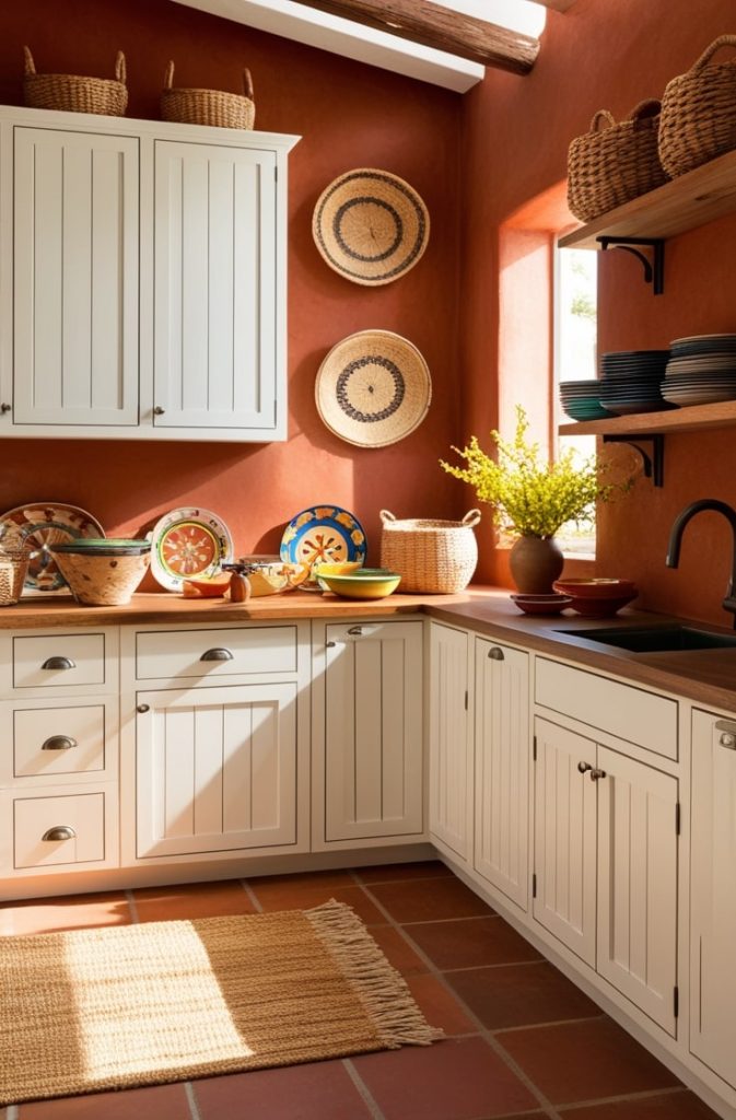
Think of baked clay, warm and sun-drenched, like a Tuscan hillside. Red Earth is earthy and vibrant, bringing rustic soul to your kitchen.
Why It Pairs with White Cabinets
Terracotta grounds white cabinets with warmth, mimicking Mediterranean charm. The contrast feels natural, like white stucco against clay roofs. It’s bold but not overpowering, making your kitchen feel like a global retreat.
Pros and Cons
| Aspect | Pros | Cons |
| Space | Cozies up expansive kitchens | Warms too much in hot climates |
| Mood | Vibrant, grounded | Overpowers subtle designs |
| Maintenance | Masks grease | Absorbs odors if not sealed |
Styling Tips
Pair Red Earth with woven baskets and saltillo tiles. A flat finish gives an authentic patina. Add open shelves with ceramic dishes for that villa vibe. I’d use this in a large kitchen to create a cozy focal point.
Verdict
Adventure seekers, this is your color. It infuses global flair, perfect for cultural cooking enthusiasts. I used a terracotta shade in my dining area, and it feels like a trip to Italy every night.
8. Deep Green
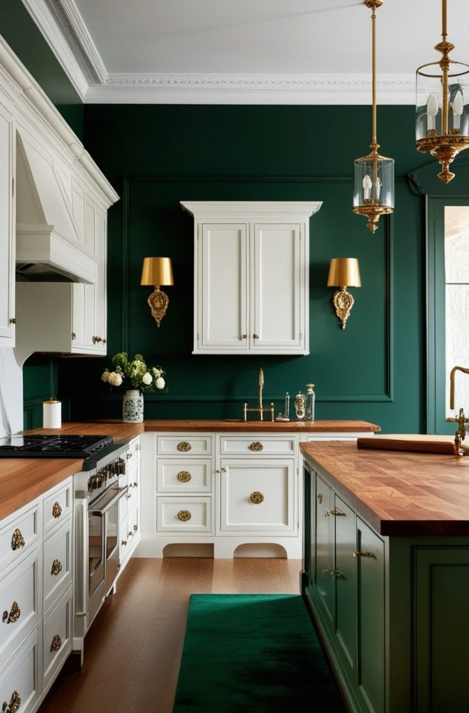
Imagine a lush forest, emerald and enveloping, like an enchanted woodland. Hunter Green is rich and luxurious, with a timeless elegance.
Why It Pairs with White Cabinets
This deep green creates a dramatic backdrop, with white cabinets acting like bright branches. It’s heritage-inspired, evoking grand estates. The white keeps it fresh, preventing a heavy feel. Your kitchen will feel like a retreat.
Pros and Cons
| Aspect | Pros | Cons |
| Space | Intimates cozy corners | Compresses tight layouts |
| Mood | Luxurious, restorative | Can lean “dated” without updates |
| Maintenance | Excellent for humidity | Shows pet hair starkly |
Styling Tips
Pair Hunter Green with brass sconces and butcher block counters. Velvet accents add opulence. Use it on a feature wall or island to keep things balanced. I love this for traditional or eclectic kitchens.
Verdict
Nature lovers, this green is for you. It aligns with biophilic design, boosting mental health. I painted my friend’s kitchen island this shade, and it’s now her favorite spot to unwind.
9. Soft Blue
Picture a powdered sky, airy and serene, like a breezy seaside escape. Breath of Fresh Air is light and calming, perfect for a tranquil kitchen.
Why It Pairs with White Cabinets
This soft blue echoes white’s coolness, creating an ethereal, open feel. It avoids the “all-white” blandness while keeping things light. Your kitchen will feel like a coastal haven, even if you’re landlocked.
Pros and Cons
| Aspect | Pros | Cons |
| Space | Amplifies height illusion | Washes out in overcast light |
| Mood | Peaceful, creative | Less warmth for gatherings |
| Maintenance | Reflects light evenly | Prone to blue-toned stains |
Styling Tips
Pair Breath of Fresh Air with coastal white accents and linen curtains. A high-gloss finish adds a reflective pop. Add driftwood shelves for texture. I’d use this in a small kitchen to make it feel taller and brighter.
Verdict
Minimalists, this is your dream. It creates an airy, photogenic space with easy flow. I tried a similar blue in my rental, and it made my tiny kitchen feel like a beach getaway.
10. Mustard Yellow
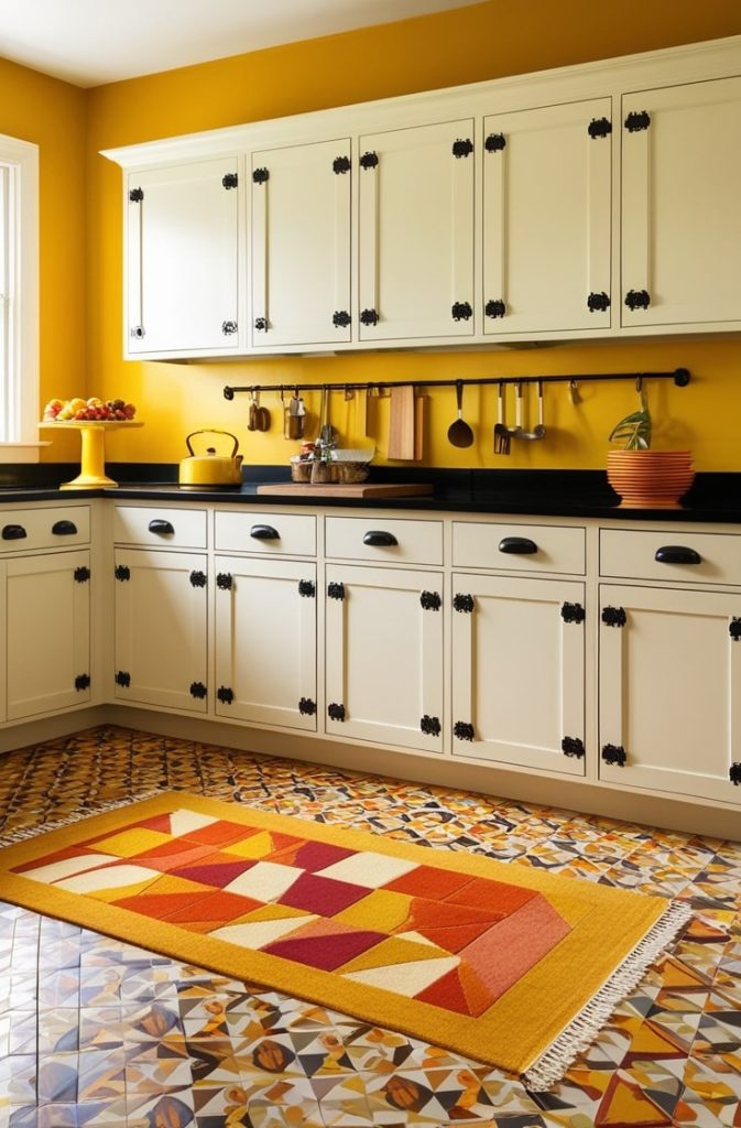
Imagine a spiced saffron glow, bold yet sunny, like a harvest moon. Honeypot is cheerful and vibrant, adding instant energy to your kitchen.
Why It Pairs with White Cabinets
Mustard yellow injects joy against white’s neutrality, warming the space without yellowing. The white keeps it grounded, creating a balanced, appetizing vibe. It’s like sunshine in your kitchen.
Pros and Cons
| Aspect | Pros | Cons |
| Space | Energizes dim corners | Overstimulates large areas |
| Mood | Optimistic, appetizing | Clashes with cool metals |
| Maintenance | Hides food splatters | Fades vibrancy over time |
Styling Tips
Use Honeypot on an accent wall or lower cabinets to avoid overwhelming. Pair with black iron hardware and geometric tiles. I love this for retro or eclectic kitchens. Add a bold rug for extra fun.
Verdict
Bold personalities, this is your color. It’s part of 2025’s “retro revival,” perfect for a fun, functional hub. I painted my pantry door mustard, and it’s now the happiest corner of my home.
11. Black
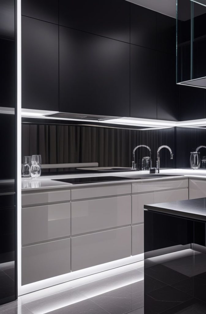
Picture an inky void, sleek and mysterious, like a velvet midnight banquet. Onyx is the ultimate statement, bold and glamorous.
Why It Pairs with White Cabinets
Black creates high-contrast glamour, making white cabinets float like stars in a night sky. It’s modern and edgy, turning your kitchen into a chic masterpiece. The white ensures it’s not too dark, keeping things balanced.
Pros and Cons
| Aspect | Pros | Cons |
| Space | Creates focal drama | Darkens and shrinks visually |
| Mood | Elegant, statement-making | Intimidating for casual use |
| Maintenance | Ultimate smudge-hider | Magnifies crumbs/dust |
Styling Tips
Pair Onyx with matte black finishes, chrome accents, and a mirrored backsplash. Layered lighting—like under-cabinet LEDs—is a must to avoid gloom. I’d use this on a single wall or island for maximum impact.
Verdict
Luxury seekers, this is your showstopper. It elevates your kitchen to high-end hotel chic. I saw a black accent wall in a client’s home, and it felt like stepping into a magazine spread.
Conclusion
We’ve explored 11 gorgeous colors, from soft grays to daring blacks, each bringing something special to your white cabinets.
Neutrals like gray and beige offer timeless ease, while bolds like navy and mustard add personality. Your white cabinets are the hero, letting these hues shine without clashing.
Whether you want calm, cozy, or chic, there’s a color here for you.
Read Also:

I’m Sloane Everly, the heart and soul behind TheTidyPorch.com, where I pour my love for home decor, interior styling, and curated living into everything I do.
I’m all about turning houses into homes that feel like you—full of warmth, character, and a little bit of magic.
My style? Think cozy charm with a splash of bold, always designed to make your space feel like a hug you never want to leave.